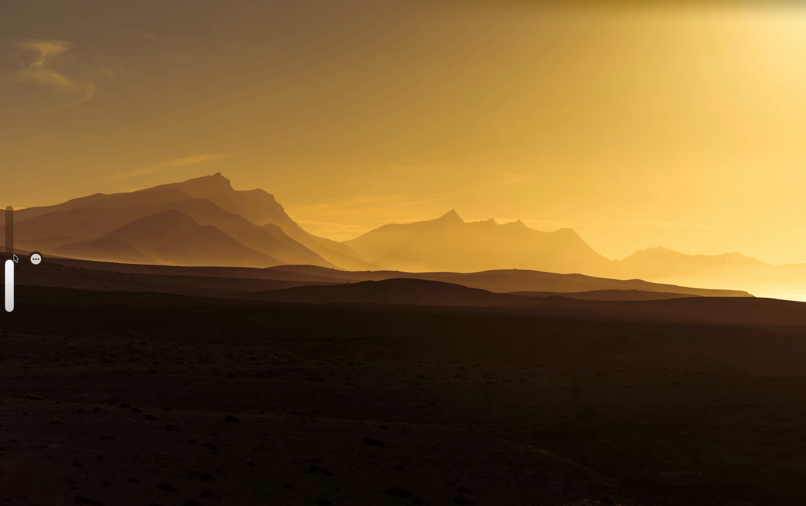
VolumeGlass replaces the default macOS volume popup that giant grey square that blocks your screen with a slim frosted glass overlay that lives on the edge of your screen and fades away when you're done. What you can do: Drag the bar to set volume precisely Double-tap to mute instantly Long press to switch audio output devices Choose from 5 screen positions Resize and reposition from settings One-time purchase, $7.99. No subscription ever.
Hey Product Hunt! 👋 I'm Aarush, a solo developer who built VolumeGlass because the default macOS volume HUD has driven me crazy for years. It pops up right in the middle of your screen in this giant grey box that feels completely out of place on a modern Mac. So I spent 6 months building a proper replacement. It uses CGEventTap to intercept the media keys so the system popup never shows, and replaces it with a native SwiftUI glass overlay. Launching with 30% off today using code LAUNCH30 valid until March 18th. Happy to answer any questions about the app or how it was built!
The original macOS volume overlay is one of those UI patterns that nobody notices until it breaks their flow — the fact that it doesn't respect your wallpaper has always been jarring. Curious whether VolumeGlass handles the edge case where the glass effect readability breaks against very light backgrounds, because that's usually where ambient UI elements start to feel like noise. Does it adjust dynamically based on the content behind it, or is it a fixed style choice? The system integration angle is the right differentiator — this is exactly the kind of thing that should feel native rather than like a third-party overlay.
That grey square has been annoying me for years and I never thought anyone would actually fix it. The long press to switch audio output is the feature I didn't know I needed — I swap between headphones and speakers constantly and the current way to do that is embarrassingly buried. One-time purchase at $7.99 is the right call too, nobody wants a subscription for a volume widget.
 Aarush Prakash