This product was not featured by Product Hunt yet. It will not be visible on their landing page and won't be ranked (cannot win product of the day regardless of upvotes).
Product upvotes vs the next 3
Waiting for data. Loading
Product comments vs the next 3
Waiting for data. Loading
Product upvote speed vs the next 3
Waiting for data. Loading
Product upvotes and comments
Waiting for data. Loading
Product vs the next 3
Loading
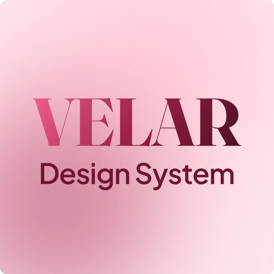
Velar Design System
200+ token-bound components · 8 candy color families
Velar is a complete Figma design system built around a pastel-candy aesthetic — warm, soft, and distinctively modern. Every component is fully token-bound, meaning one variable change rebrands the entire kit instantly. Three themes (Light, Dark, High Contrast) are built in and work at the frame level.
✨ What’s Included
🎨 Foundations — 6 Pages
🌈 Colors
88 primitive tokens across Strawberry, Bubblegum, Peach, Lemon, Mint, Sky, Lavender, and Cotton. Each family includes 11 steps from /50 to /950, with WCAG-tested contrast pairings and AAA/AA badges.
🔤 Typography
Fraunces + Inter, configured as a complete type scale with 11 named text styles and 3 control styles.
📐 Spacing & Layout
Base-4 spacing scale, from space/2xs — 4px to space/5xl — 96px.
◽ Radius, Borders & Shadows
6 named radius tokens, border tokens, and 6 elevation shadow styles.
🧩 Iconography
80+ stroke-only icons at 24px with 1.5px weight, built on Hugeicons. Every icon is recolorable via stroke override.
🖼️ Illustrations
Soft gradient placeholders sized for easy custom illustration swap-in.
🧱 Components — 22 Pages, 200+ Variants
🔘 Buttons
Primary, Secondary, Tertiary, Ghost, and Destructive. Includes 3 sizes, full state coverage — Default, Hover, Pressed, Focused, Disabled, and Loading — with leading and trailing icon support.
⌨️ Input
3 sizes with Default, Focus, Filled, Disabled, and Error states. Includes label, hint, required asterisk, leading icon, and trailing action.
📝 Textarea
Multi-line input with a full state system.
▾ Select
Closed trigger plus Select/Option sub-component for open menus.
📤 File Upload
5-state lifecycle: Empty, Hover, Uploading, Uploaded, and Error. Supports drag-and-drop and click-to-browse patterns.
☑️ Checkbox
Default, Hover, Checked, Indeterminate, and Disabled states.
🔘 Radio
Default, Hover, Selected, and Disabled states.
🔁 Switch
On, Off, and Disabled states.
📂 Accordion
Default, Hover, Expanded, and Disabled states.
📋 Lists
Composable rows with leading and trailing slots. Includes one-line, two-line, and three-line variants.
📱 Tab Bar
Mobile bottom navigation for 4–5 tabs.
🎛️ Segmented Control
Inline tab control for 2–4 options.
🪟 Modals & Sheets
3 modal sizes: Sm, Md, and Lg. Includes bottom sheet with handle bar, plus left and right side sheets with asymmetric radius.
🔔 Toast
20 variants across 5 semantic colors, with show/hide action and dismiss options.
📢 Banner
20 variants for persistent page-level messages, with action and dismiss controls.
⚠️ Alerts
36 variants. Includes Inline and Stacked types, Subtle, Solid, and Stroke styles, across 5 semantic colors.
🏷️ Tag
63 variants. Includes 4 styles: Subtle, Solid, Stroke, and Ghost, with optional leading icon and trailing dismiss.
🔖 Badge
18 variants. Includes Dot, Count, and Label types.
👤 Avatar
24 variants with status indicator as a component property.
🫙 Empty & Error States
No Items, No Results, No Permission, and Network Error.
🛠️ Misc & Utility
Slider, Stepper, OTP, Divider, Skeleton, and Spinner.
📸 Examples
30+ real-world product screens built from Velar components.
⚙️ Token System
Velar uses a scalable token structure designed for real product work:
🧬 3-layer architecture: Primitives → Semantic → Component
🌗 Semantic/Theme collection with Light, Dark, and High Contrast modes
🎨 Semantic/Brand collection for full rebrand control
⚡ Rebrand the entire kit by editing only 5 accent/* tokens
🔄 Buttons, inputs, checkboxes, switches, badges, and accent surfaces update instantly
🌓 Frame-level mode override lets you show a dark card inside a light page without duplicating anything
👥 Who It’s For
Velar is built for intermediate to advanced Figma designers who want a kit that is architecturally sound, not just visually pretty.
If you care about token systems, scalable component structures, clean component logic, and a design system that actually holds up in production handoff, Velar is for you.
About Velar Design System on Product Hunt
“200+ token-bound components · 8 candy color families”
Velar Design System was submitted on Product Hunt and earned 5 upvotes and 1 comments, placing #21 on the daily leaderboard. Velar is a complete Figma design system built around a pastel-candy aesthetic — warm, soft, and distinctively modern. Every component is fully token-bound, meaning one variable change rebrands the entire kit instantly. Three themes (Light, Dark, High Contrast) are built in and work at the frame level.
On the analytics side, Velar Design System competes within Design Tools, User Experience and Developer Tools — topics that collectively have 1.1M followers on Product Hunt. The dashboard above tracks how Velar Design System performed against the three products that launched closest to it on the same day.
Who hunted Velar Design System?
Velar Design System was hunted by Ayman Shaltoni. A “hunter” on Product Hunt is the community member who submits a product to the platform — uploading the images, the link, and tagging the makers behind it. Hunters typically write the first comment explaining why a product is worth attention, and their followers are notified the moment they post. Around 79% of featured launches on Product Hunt are self-hunted by their makers, but a well-known hunter still acts as a signal of quality to the rest of the community. See the full all-time top hunters leaderboard to discover who is shaping the Product Hunt ecosystem.
For a complete overview of Velar Design System including community comment highlights and product details, visit the product overview.
 Ayman Shaltoni